Streamlining the product data model, simplifying navigation, and guiding users towards the perfect case and accessories for their devices, enhancing product discovery and driving conversions through a customer-centric approach.

Significantly reduced product count, making browsing easier for customers.
Optimized filtered views eliminate back-and-forth, creating a smoother browsing experience.
Provided a user-friendly process for phone model and accessory choices.
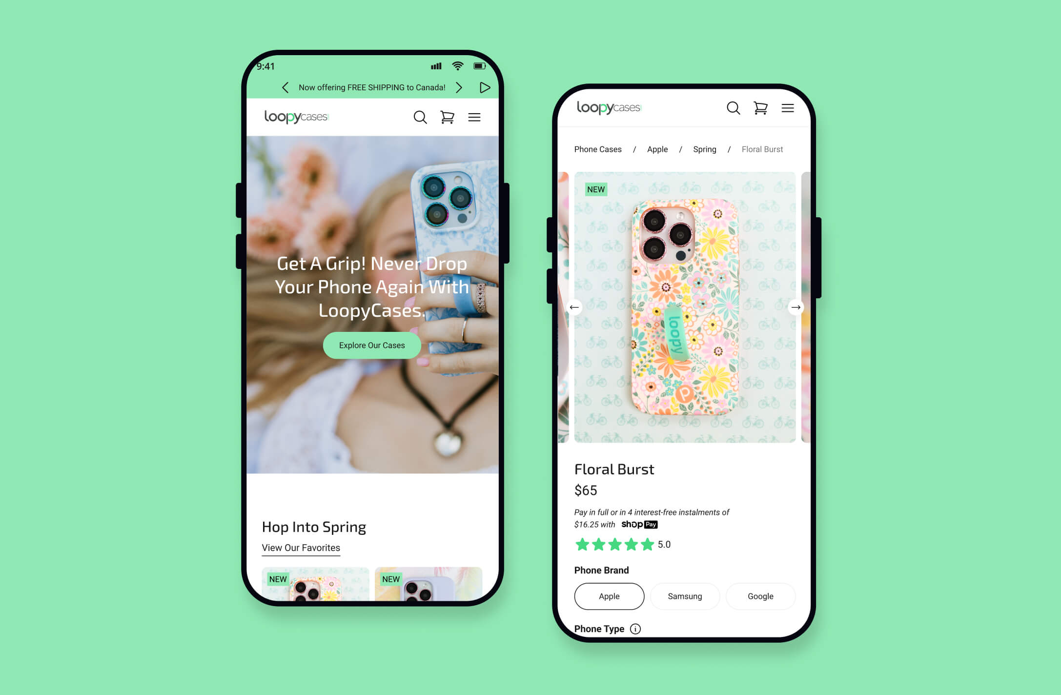
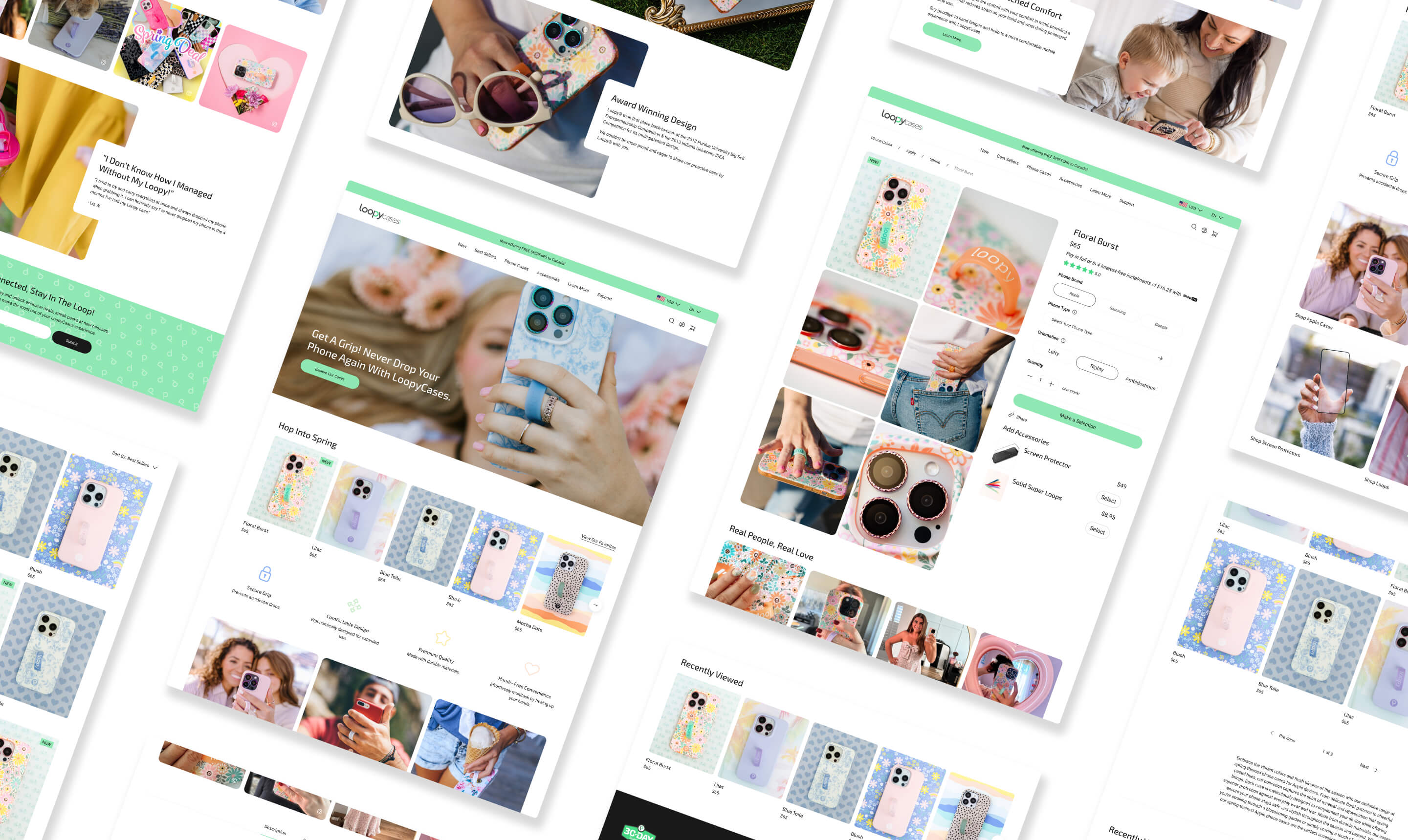
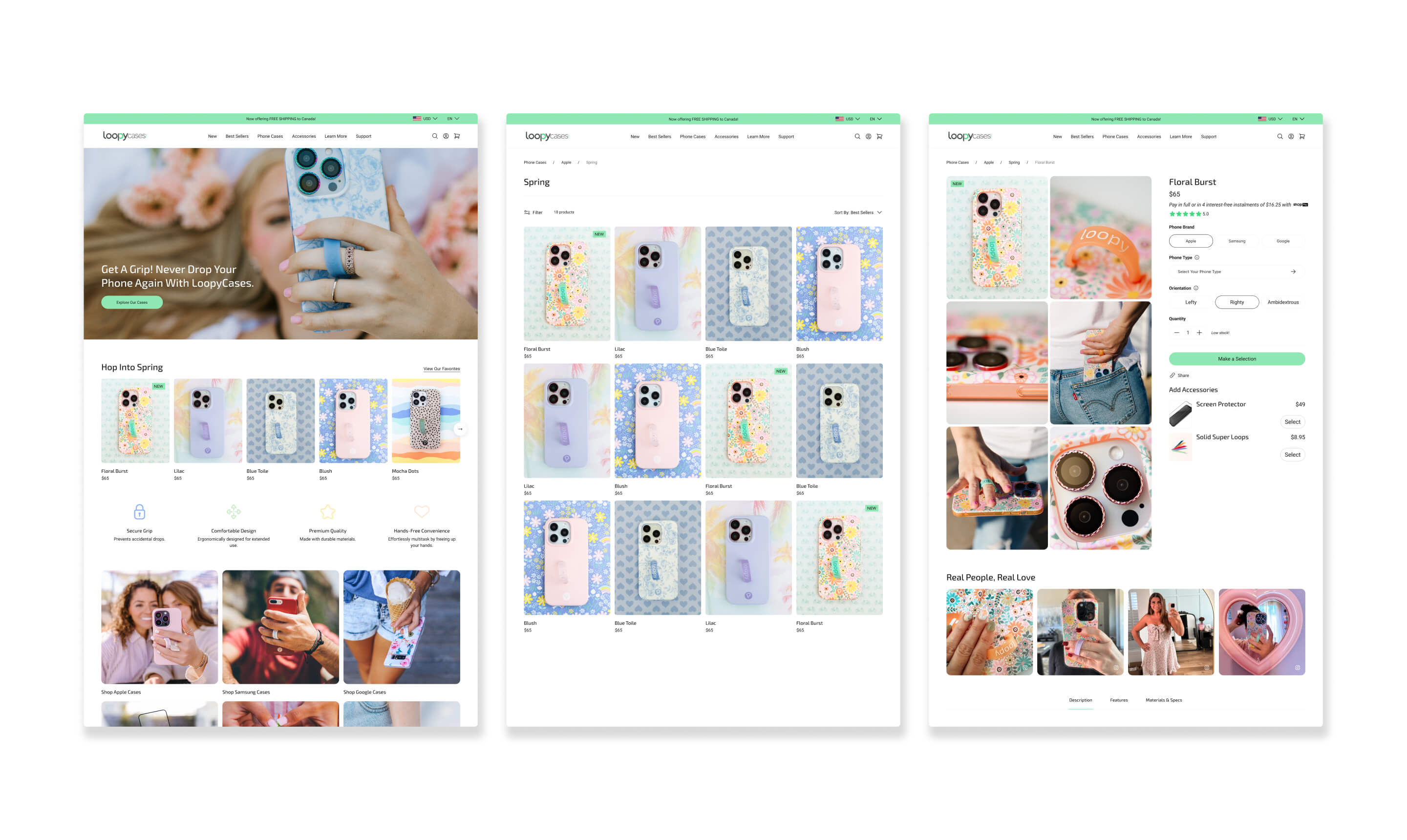
Simplified Product Data Model Implementation: We consolidated the case catalog to one product per case design with phone variants, transforming a previously complex system of individual products into a streamlined structure. This simplification significantly reduced product redundancy and improved data management efficiency.
Optimized Navigation with Filtered Views: The number of collections was condensed by strategically using filtered views directly from the navigation. This innovative approach allows users to easily switch between phone models from the same page, eliminating unnecessary clicks and creating a more seamless browsing experience.
Guided Phone Model Selection Process: To simplify the phone model selection process, we implemented several key features: pre-selected variants for users arriving from search, visually clear options highlighted with a "Loopy green" background, smart filtering of side panel models by brand, and visual confirmation through variant image changes to match the user's selection.
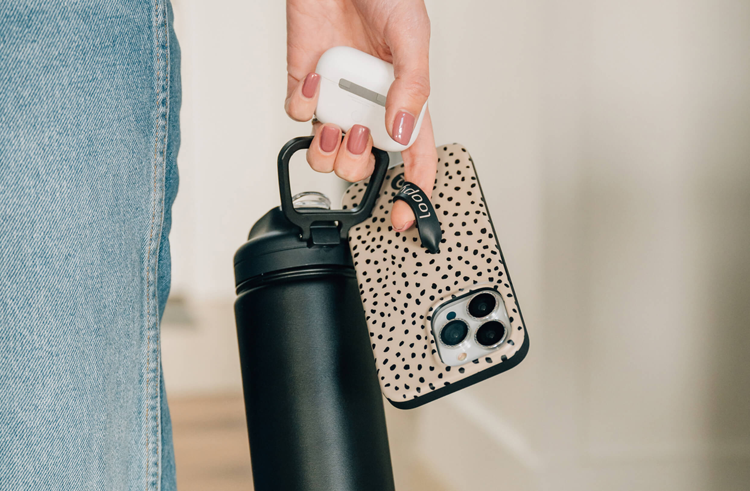
Enhanced Accessory Selection Experience: We enabled variant image changes when an accessory selection is made. This visual confirmation helps the user verify their choice matches the accessory color, type, or pattern, ensuring accuracy and enhancing the overall confidence in their purchase.
Significantly Simplified Product Discovery: The implementation of a simplified product data model dramatically reduced the number of products, making it significantly easier for customers to browse and find exactly what they're looking for, leading to a more efficient shopping journey.
Seamless & Efficient Navigation: Optimized navigation with filtered views eliminated the need for users to navigate back and forth between different collections, creating a truly seamless browsing experience that reduces friction and improves user flow.
Intuitive & User-Friendly Guided Selection: The guided phone model selection and connected product galleries for accessories provided a more intuitive and user-friendly shopping experience. This ensures customers can confidently make their choices with clear visual feedback.
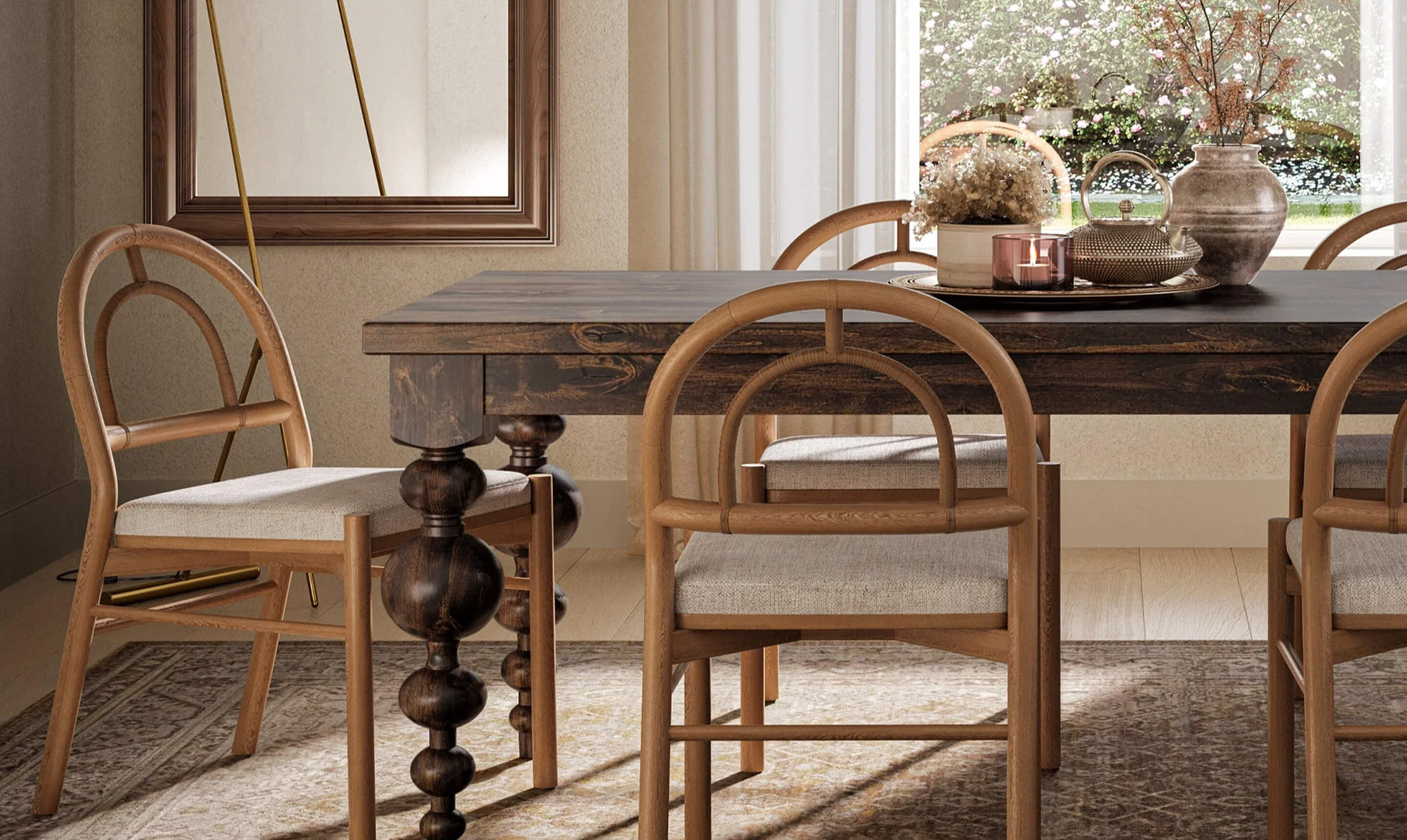
Cohesive Design & Enhanced Shopping Experience: The implementation of a flexible style guide created a more consistent and visually appealing shopping experience across the entire website. This cohesive design reinforces brand identity and contributes to a more enjoyable user journey.

Keep exploring and discover more projects and the impact behind them.
